
We’ve got the elements of a solution now, and we’ve de-risked our concept to the point that we’re confident it’s a good option to give a team. But the concept is still in our heads or in some hard-to-decipher drawings on the whiteboard or our notebook. Now we need to put the concept into a form that other people will be able to understand, digest, and respond to.
This is where we say “Okay, this is ready to write up as a pitch.” In this chapter, we’ll walk through the ingredients of a pitch and show some fully worked out examples from real projects at Basecamp.
The purpose of the pitch is to present a good potential bet. It’s basically a presentation. The ingredients are all the things that we need to both capture the work done so far and present it in a form that will enable the people who schedule projects to make an informed bet.
There are five ingredients that we always want to include in a pitch:
- Problem — The raw idea, a use case, or something we’ve seen that motivates us to work on this
- Appetite — How much time we want to spend and how that constrains the solution
- Solution — The core elements we came up with, presented in a form that’s easy for people to immediately understand
- Rabbit holes — Details about the solution worth calling out to avoid problems
- No-gos — Anything specifically excluded from the concept: functionality or use cases we intentionally aren’t covering to fit the appetite or make the problem tractable
Ingredient 1. Problem
It’s critical to always present both a problem and a solution together. It sounds like an obvious point but it’s surprising how often teams, our own included, jump to a solution with the assumption that it’s obvious why it’s a good idea to build this thing.
Diving straight into “what to build”—the solution—is dangerous. You don’t establish any basis for discussing whether this solution is good or bad without a problem. “Add tabs to the iPad app” might be attractive to UI designers, but what’s to prevent the discussion from devolving into a long debate about different UI approaches? Without a specific problem, there’s no test of fitness to judge whether one solution is better than the other.
Establishing the problem also lets us have a clearer conversation later when it’s time to pitch the idea or bet on it. The solution might be perfect, but what if the problem only happens to customers who are known to be a poor fit to the product? We could spend six weeks on an ingenious solution that only benefits a small percentage of customers known to have low retention. We want to be able to separate out that discussion about the demand so we don’t spend time on a good solution that doesn’t benefit the right people.
How far you have to go to spell out the problem will depend on how much context you share with the people reading the write-up. The best problem definition consists of a single specific story that shows why the status quo doesn’t work. This gives you a baseline to test fitness against. People will be able to weigh the solution against this specific problem—or other solutions if a debate ensues—and judge whether or not that story has a better outcome with the new solution swapped in.
Ingredient 2. Appetite
You can think of the appetite as another part of the problem definition. Not only do we want to solve this use case, we want to come up with a way to do it in six weeks, not three months, or—in the case of a small batch project—two weeks, not the whole six weeks.
Stating the appetite in the pitch prevents unproductive conversations. There’s always a better solution. The question is, if we only care enough to spend two weeks on this now, how does this specific solution look?
Anybody can suggest expensive and complicated solutions. It takes work and design insight to get to a simple idea that fits in a small time box. Stating the appetite and embracing it as a constraint turns everyone into a partner in that process.
Ingredient 3. Solution
Like solutions with no problems, sometimes companies bet on problems with no solution. “We really need to make it easier to find things on the messages section. Customers are complaining about it.”
That’s not ready to pitch or bet on. A problem without a solution is unshaped work. Giving it to a team means pushing research and exploration down to the wrong level, where the skillsets, time limit, and risk profile (thin vs. heavy tailed) are all misaligned.
If the solution isn’t there, someone should go back and do the shaping work on the shaping track. It’s only ready to bet on when problem, appetite, and solution come together. Then you can scrutinize the fit between problem and solution and judge whether it’s a good bet or not.
Help them see it
During the elements phase, it was critical to sketch ideas at the right level of abstraction so we didn’t slow down or lose any of the ideas appearing at the corners of our brains and tips of our tongues.
We also need to draw at the right level of detail when we write the pitch. Here the challenge is a little different. We have time to slow down and prepare a proper presentation. We need to stay high level, but add a little more concreteness than when we worked alone or with a partner. People who read the pitch and look at the drawings without much context need to “get” the idea.
We need more concreteness, but we don’t want to over-specify the design with wireframes or high-fidelity mocks. They’ll box in the designers who do the work later. We also risk side-tracking the discussion into topics like color, proportions, or layout that have nothing to do with the actual shaping work we did.
At the same time, hand-written breadboards have a “you had to be there” quality to them. To people who didn’t watch the breadboard unfold step by step, it can look like a soup of words and arrows.
Therefore we need some techniques to help people see the idea while still not going too far into irrelevant details.
Embedded sketches
Suppose your breadboard from the shaping session looked like this:

People might have trouble visualizing where these new affordances go on the Dashboard. We could sketch a new box on the Dashboard to make it clearer:

But we’re still asking people to imagine too much. It’s worth the trade-off to go one step down into fat-marker detail here.

This makes it easier to see what the elements are and evaluate how clearly the feature presents itself on the dashboard. The downside is we’ve gotten into some layout decisions that would have been nice to avoid. Designers should feel free to find a different design than the box divided with a vertical line. We’d add a disclaimer here in the pitch that reminds designers of the latitude they should take.
This is an example of selectively getting into more visual detail because we need it to sell the concept. Fortunately, we won’t need to make as many visual decisions in other parts of the concept. This was a “linchpin” part of the design that everybody had to see concretely in order to “get” it.
Annotated fat marker sketches
Sometimes ideas are inherently visual or a little too complicated to express in a schematic breadboard. Fat marker sketches can be very effective in a pitch; you just need to take more care to label them cleanly.
Redrawing the sketch on an iPad—still with a fat brush size—works well. You can use different colors to separate the labels from the material parts of the sketch.

Or you might add some call-outs to enable discussion of specific elements.

Ingredient 4. Rabbit holes
Sometimes addressing a rabbit hole just requires a few lines of text. For example, in the Payment Form project above, the shapers wanted to call out a specific solution for how to create URLs. The URLs would never live on custom domains for v1 of the project. This is the kind of thing that’s not central to the concept, but spelling it out patches a potential rabbit hole.
Ingredient 5. No Gos
Lastly if there’s anything we’re not doing in this concept, it’s good to mention it here. In the case of the Payment Form project, the team decided up front that they wouldn’t allow any kind of WYSIWYG editing of the form. Users would only be able to provide a logo and customize the header text on a separate “customize” page. WYSIWYG might be better in some peoples’ eyes, but given the appetite it was important to mark this as a no-go.
Examples
Here are two examples of real pitches.
This pitch for grouping to-dos together starts by showing a workaround people are using in the current design. Then it sketches out all the main ideas for how to enable optional to-do groupings.
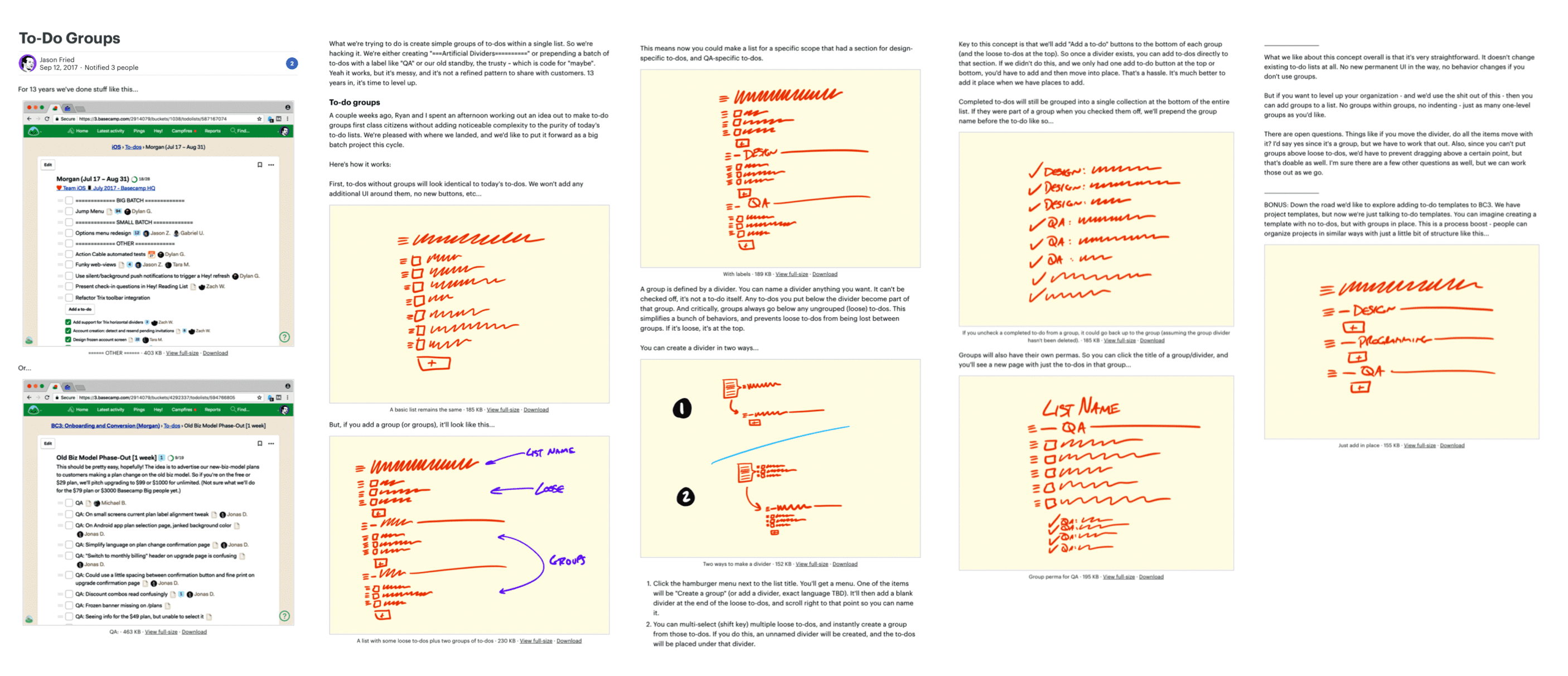
Two screenshots demonstrate the problem. Fat marker sketches describe the solution. Rabbit holes motivated some of the sketches.
This pitch for changing how notifications work starts with two videos to demonstrate the problem. The black boxes toward the end are a visualization of user behavior data that supports a decision in the pitch.
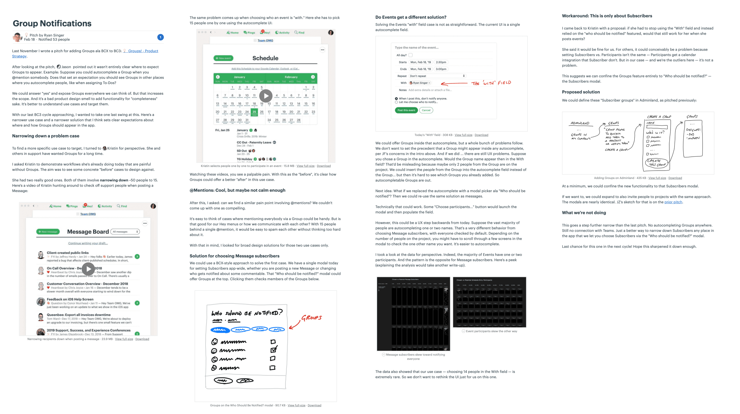
Two videos show the problem. A fat marker sketch and a breadboard describe the solution. The black boxes contain data visualizations that support trade-offs in the solution.
Ready to present
The next step will be to make the case that this pitch describes a bet worth making. This can happen in a couple ways.
We prefer asynchronous communication by default and escalate to real-time only when necessary. This gives everyone the maximum amount of time under their own control for doing real work. That means the first step for presenting a pitch is posting the write-up with all the ingredients above somewhere that stakeholders can read it on their own time. This keeps the betting table short and productive. In ideal conditions everyone has time to read the pitches in advance. And if that isn’t possible in some cases, the pitch is ready to pull up for a quick live sell.
How we do it in Basecamp
We post pitches as Messages in Basecamp. We created a Message Category called Pitch so we can easily find them. Pitches are posted to a Team called Product Strategy that can be accessed by people on the betting table.
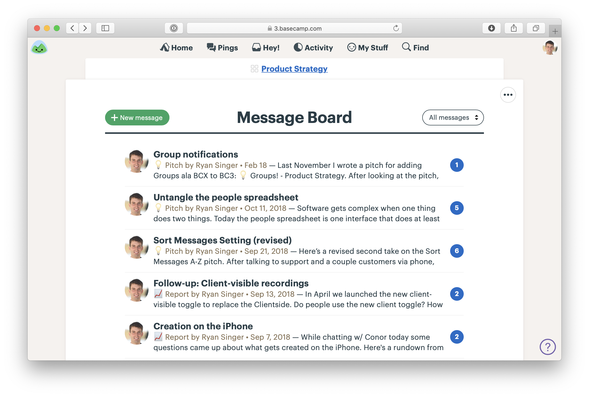
Pitches on the Message Board of the Product Strategy team in Basecamp
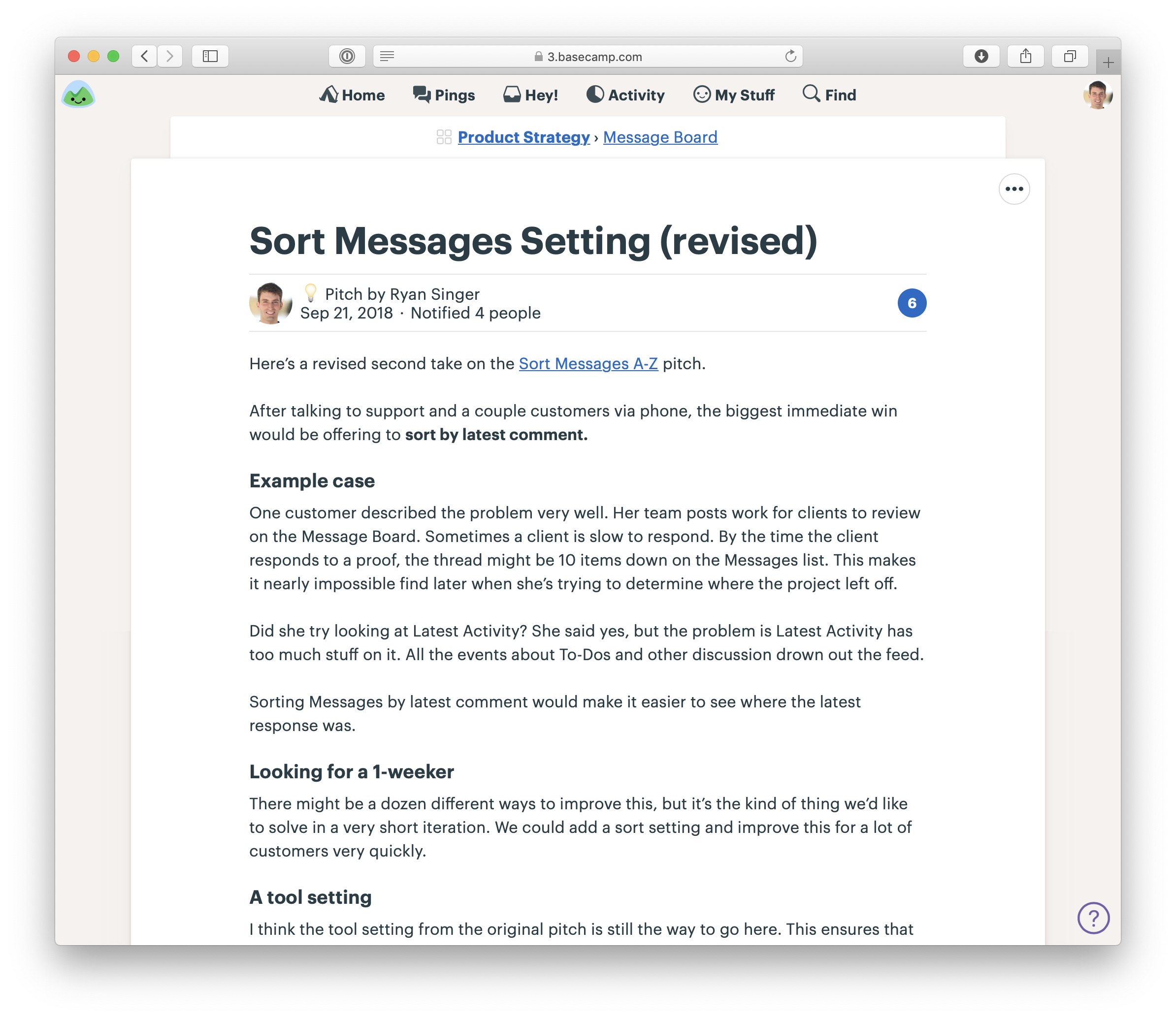
A pitch as a Message. Note the one-week appetite. This was a Small Batch project.
When we need to include a fat marker sketch in a pitch, we’ll draw it on an iPad (with Notability) and take a screenshot. Basecamp’s text editor makes it easy to insert images and caption them so they make sense in the flow of the pitch.
A sketch drawn on an iPad in the middle of a pitch
People comment on the pitch asynchronously. Not to say yes or no — that happens at the betting table — but to poke holes or contribute missing information.
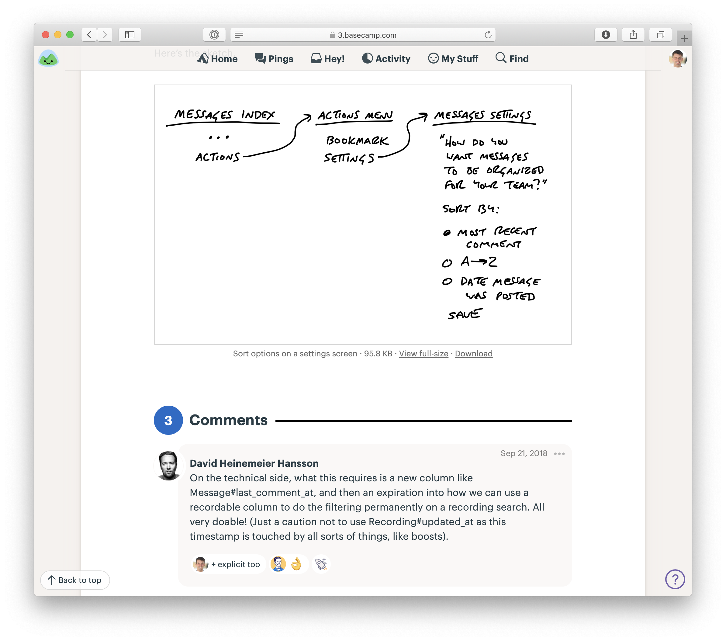
Our CTO responds with technical thoughts on the pitch.
In the next chapter we’ll look at the betting process in more detail to see where pitches go and how we turn them into scheduled projects.