• Home
  • Articles
  • More is Not Always Better, Especially With Task Management Software

More is Not Always Better, Especially With Task Management Software

Why you can (and should) be doing more with less.

We’re living in a world insistent on more while simultaneously suffering from it. We don’t need to point to the average American’s debt-to-income ratio to see it.

It’s written clearly:

All over our excessively wordy job titles (Director of Client Experience not Customer Support).

All over the brand new car with a dozen features you don’t even use, but who cares, you might need to go off-roading that one very specific time.

All over the stockpile of uncelebrated achievements shrouded by the promise of things being even better once you hit that next goal.

This isn’t new. There are hundreds of books exploring the toxicity of more (The Happiness Advantage, The Happiness Gap, 10% Happier, focusing on reducing what you want by appreciating what you have.

Even Dudley Dursley, an icon of what happens when more is your only goal, showcased this in his character introduction, “Thirty-six? But last year, last year there were thirty-seven.” To which his mother announced they would get “two new presents” when they went out that day.

But this isn’t just fiction.

You can’t take anything with you when you die is a phrase we’ve all heard time and time again.

We know this. And yet we’re still lured in by promises of more.

Let’s take apps and software for a modern-day example.


The Number of Features is a Selling Point…Does That Mean a Product is Better?

If you know anything about coding or app development, you know how backwards it is to assume more features means a better product. More functionality doesn’t mean that it will solve your problem more effectively.

It’s like hiring someone to fix your refrigerator, except they run eight tests, remove a few parts just to put them back, take out all the food, poke around some more, and then return all of the food only to be left without an answer as to why it’s not running. “You need a new fridge,” they say, shrugging. Then they charge you an insane amount for the fact that they “…did more than you asked for.” Come on, man!

It’s far more effective to hire the person who can come in, take in the situation, and have a diagnosis and replacement quickly—usually based on experience. In this case, the right work is being performed, without all the fluff and unnecessary tasks.

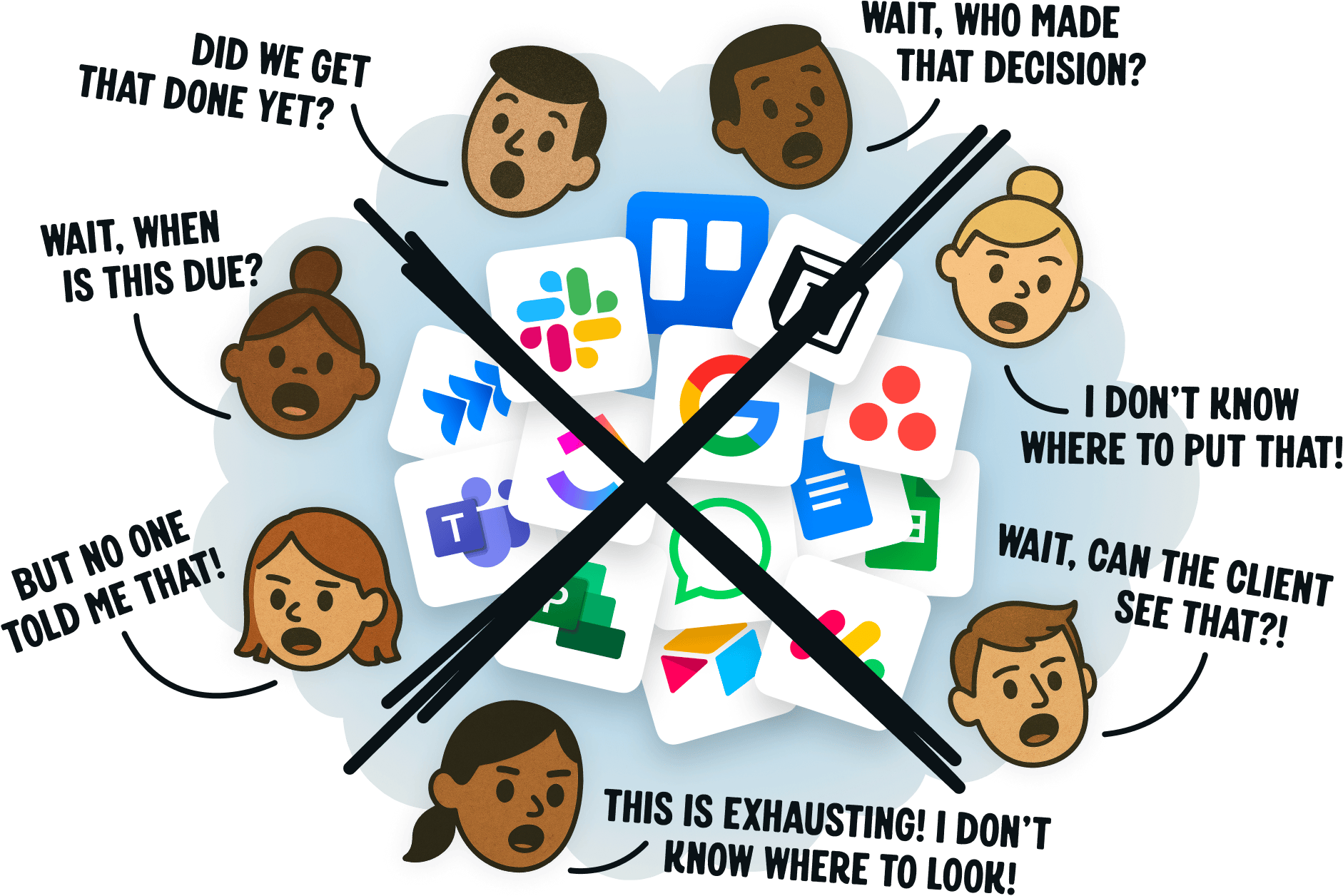
Similarly, some project management apps will have pages of features, sending you around their site multiple times just to learn what it is their program can do. They’ll list their features off in comparison charts just to show the user how “advanced” they are when their column is stacked and their competitor’s is simple.

Does this work to get trial sign ups? Maybe. But is it fulfilling the needs of the end user? No.

In Getting Real, Jason Fried and David Heinemeier Hansson’s book dedicated to teaching The Smarter, Faster, Easier Way to Build a Successful Web Application (based on their two decades of experience, including the building of Basecamp), they discuss the seemingly counterintuitive idea of building less.

“Conventional wisdom says that to beat your competitors you need to one-up them. If they have four features, you need five (or 15, or 25). If they’re spending x, you need to spend xx. If they have 20, you need 30.

This sort of one-upping Cold War mentality is a dead-end. It’s an expensive, defensive, and paranoid way of building products. Defensive, paranoid companies can’t think ahead, they can only think behind. They don’t lead, they follow.”

But why is this more mentality not better? What is it about having too many options, features, ideas, people that causes problems?


More Options Leads to Fewer Decisions

Anyone worth their salt in the marketing world knows that you can’t present too many options to a user on your site. If you offer them a free trial and a checklist and a discount code via email all in the span of a single blog post, they’re not likely to choose any.

If you pick one and list only that, the conversion rate increases significantly.

Decision fatigue is at the core of this issue.

Take the famous Jam experiment of 2000 (after which many like studies have been conducted). In this study by Sheena S. Iyengar and Mark R. Lepper of Stanford, it was discovered that when presented with 24 options of jam versus only 6 options on display at a store, the days where only 6 options were available actually saw more sales.

This data has been shared ad nauseam in the online business world. But what’s often left out of these discussions is the overall satisfaction of the choices made by buyers.

In the very last paragraph of this 1000+ page study, Iyengar and Lepper point out something that has been long since understood by those paying attention and not even considered by those with their heads in the sand:

“Having unlimited options, then, can lead people to be more dissatisfied with the choices they make.”

Even when people bought when there were 24 options available, they experienced less satisfaction in their choice purely because of the number of options available.

What does this look like in the task management software world?

If you create four methods to perform a single function, users can be less satisfied with each of the four they choose—toggling between views without finding just what they’re looking for—simply because there are more options. When one way to view a page is all you have, you’re perfectly happy to have that function (so long as it’s made well).

You can also think of it like kids and toys.

While Richard, who lives in a three story Victorian home up the street, may have an endless amount of toys at his disposal, he’s constantly switching between them, dissatisfied with the play each offers, always seeking what the other toys in his vision have to offer. But Billy in the tiny corner house? He has one toy that he spends hours enjoying to its full extent.


Give fewer options, and make those options the best they can be. More is not always better, even when people don’t recognize it for themselves…yet.

And if you’re interested in task management software that is crafted to do more with less confusing, complicated features, consider the all-new Basecamp. It has everything you need (and nothing you don’t) to do your best work and keep everyone up to speed. Best of all, you can get started for free in just 30 seconds:

We’d like to use a cookie to help us understand if our ads are working or not.