There are lots of ways to manage projects. And there’s plenty of software promising to help. You’ve probably tried some. Yet, here you are.
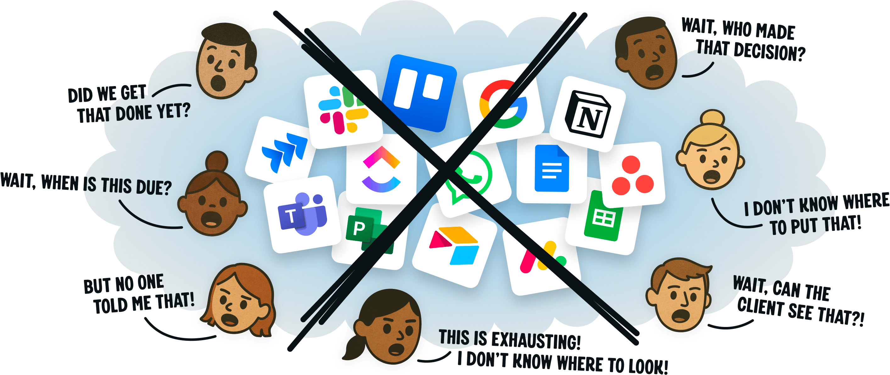
Unfortunately, most project management systems are either overwhelming, inadequate, bewildering, or chaotic. You know?
Not Basecamp. Basecamp is refreshingly straightforward, with a 21-year track record to back it up. Longevity isn’t luck — it’s proof it works. And you’ll work better with it too.
Basecamp is famously no-nonsense, effective, and reliable. The trifecta. It’s designed for smaller, hungrier businesses, not big, sluggish ones. Over 30 pages of customer testimonials detail how things run better on Basecamp.
So, we invite you to poke around, watch the video below, and try Basecamp for free. We’d be honored to have you as a customer. Thank you.
- Jason Fried, jason@basecamp.com
- Co-founder & CEO